Our work on using social media continues to develop and we have recently had a paper accepted in Transactions in GIS, entitled "#Earthquake: Twitter as a Distributed Sensor System". Below we present our abstract and some of the results.
Social media feeds are rapidly emerging as a novel avenue for the contribution and dissemination of information that is often geographic. Their content often includes references to events occurring at, or affecting specific locations. Within this paper we analyze the spatial and temporal characteristics of the twitter feed activity responding to a 5.8 magnitude earthquake which occurred on the East Coast of the United States (US) on August 23, 2011. We argue that these feeds represent a hybrid form of a sensor system that allows for the identification and localization of the impact area of the event. By contrasting this to comparable content collected through the dedicated crowdsourcing ‘Did You Feel It?’ (DYFI) website of the US Geological Survey we assess the potential of the use of harvested social media content for event monitoring. The experiments support the notion that people act as sensors to give us comparable results in a timely manner, and can complement other sources of data to enhance our situational awareness and improve our understanding and response to such events.
The movie below show geolocated tweets with references to the earthquake through keyword (earthquake or earth and quake) and hashtag search (#earthquake or #quake) for the first hour after the earthquake.
The following images give a glimpse at some of our analysis.
 |
| Response pattern as function of distance from epicenter for the first 400 seconds after the earthquake. At the top we see a plot of (reaction time, distance) of all tweets during that period. At the bottom we show the histogram of the number of tweets as a function of distance. |
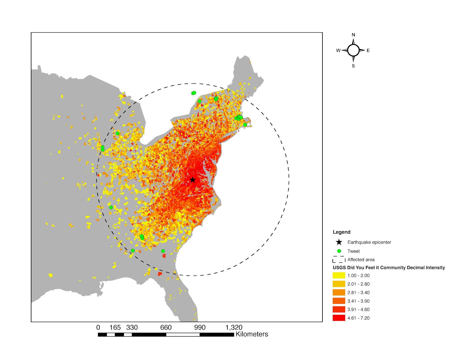 |
| Locations of the 40 tweets in the shaded area of the figure above overlaid over the USGS CDI scale map. Tweet locations are marked as green circles. Color-coding in the graph is ranging from red (high perceived intensity) to yellow (lower perceived intensity). The dashed line shows a distance of approximately 950 km (8.5 degrees of angular distance) from the epicenter. |
Full reference to this paper is:
Crooks, A.T., Croitoru, A., Stefanidis, A. and Radzikowski, J. (2013), #Earthquake: Twitter as a Distributed Sensor System, Transactions in GIS, 17(1): 124-147. (pdf)
No comments:
Post a Comment